So today we have released Ulysses 12. And as is good tradition around the house, I’d like to talk a little about what’s new and improved. And since this release is mostly about changes to Ulysses on iOS, I’ll start with a cross-platform addition, so Mac-only users can go home early…
Editor Image Previews
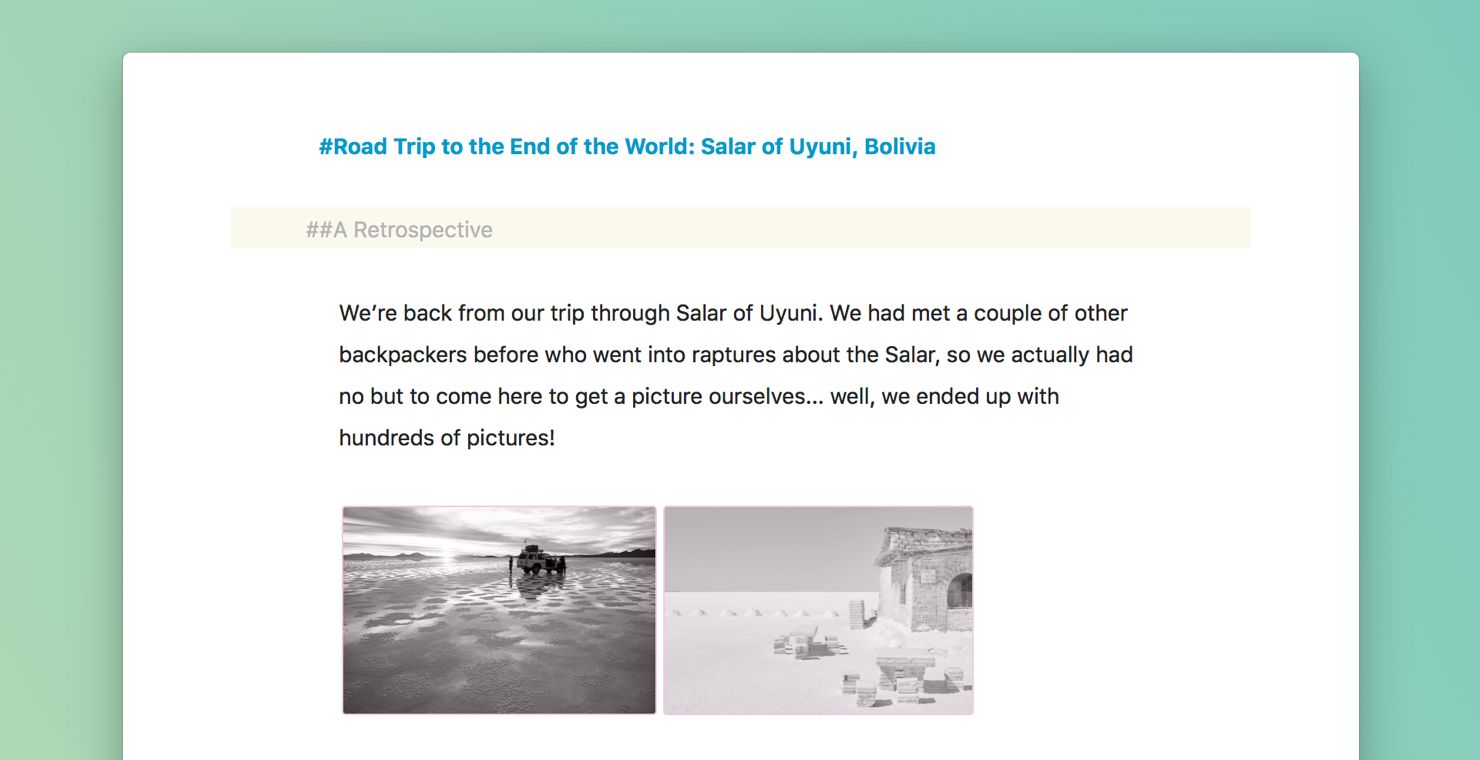
One of the most requested features among our users has always been the ability to view images within the editor. I don’t want to bore you with the specifics of why it took us so long, because it doesn’t matter anymore — it’s finally here.
By default, images that reside in their own paragraph, will be rendered as black & white thumbnails, while images that exist within text passages, will continue to be rendered as our beloved IMG-bubble.
Why black & white? And why just thumbnails? To keep you in the text. During development, we found that normalizing all previews will increase text immersion, while still providing enough context. This is especially true for colorful themes in the editor, which tend to easily clash with full color images and thus require users to tinker with formats etc. — something we wanted to avoid in the first place. We are aware, of course, that our approach won’t fit all uses (diagrams come to mind), so consider this a first step, and we’re gladly awaiting your feedback.
Drag and Drop on iOS
We have covered this in our previous post, so I won’t go into too much detail, but we have vastly expanded the scope since the last time I wrote about it. To sum it up: Ulysses now supports drag and drop in almost all portions of the app, and in probably exactly the way you would expect.
You can drag around sheets, reorder them or drop them into groups, drag text from one sheet to another, and even create new sheets from text dropped into the sheet list. You can drag text to the attachment bar to create a note attachment, and you can drop images there to create an image attachment. You can then of course drag these into the editor.
This also extends to multi-tasking on iPad, where you can now drag text and images from, say, Safari into the editor, or from Ulysses into Mail. We also support dragging text files from the Files app into Ulysses, so you can quickly edit some stuff stored… wherever.
We encourage you to try this stuff out, especially when moving sheets. There are several nice touches (no pun), such as spring-loading groups, auto-navigation when dragging over buttons on iPhone etc. — and again: let us know how all this works for you.
Swipe Actions on iOS
With the advent of iOS 11, Apple has further opened up some of their APIs, so that third-party developers can now do more of the things Apple is doing in their own apps. One of these things are vastly enhanced options when it comes to swipe actions.

$("#gifdiv1").click(function () { if ($(this).find("img").attr("data-state") == "static") { $(this).find("img").attr("src", "/content/images/wordpress/2017/10/swipeactions.gif"); $(this).find("img").attr("data-state", "); } else { $(this).find("img").attr("src", "/content/images/wordpress/2017/10/SwipeActionStatic.png"); $(this).find("img").attr("data-state", "static"); } });
We can now have several actions available to the left and right, in addition to two actions that can be activated via swipe-through. We took a real close look into which commands to enable via these actions, especially in the light of Drag and Drop arriving at the same time.
For sheets, we went for setting keywords (swipe left) and marking as Favorite (swipe right). For groups and filters in the Library, we went with editing details (swipe left), and a brand new feature called Library Focus (swipe right; more on that later). We also added various special actions to various special places, such as “Hide” on External Files etc., so again it’s probably best to experiment a bit and see what’s happening…
Library Focus on iOS
This is a feature that has been on our drawing board since day one. Since Ulysses is designed to hold all your stuff, all your projects, blogs, everything, the Library tends to grow rather large over time. It’s not unusual for users to have dozens of top-level groups on display, all with multiple sub-groups and whatnot.
And while you can always collapse parent groups (another thing we improved in this release), you sometimes want to just… focus on one particular project and not see everything else. Now you can.
$("#gifdiv2").click(function () { if ($(this).find("img").attr("data-state") == "static") { $(this).find("img").attr("src", "/content/images/wordpress/2017/10/focusmode.gif"); $(this).find("img").attr("data-state", "); } else { $(this).find("img").attr("src", "/content/images/wordpress/2017/10/LibraryCollapseStatic.png"); $(this).find("img").attr("data-state", "static"); } });
Previous versions on iOS had already offered something along these lines, but it was rather hidden, limited, and not very intuitive. You had to have subgroups, for example, and you would lose the ability to access Favorites, and you had to know about tapping the blue double caret etc. — forget it.
With Ulysses 12, you now just swipe any group to the right, to have the Library collapse down to focus on just that particular group.
This is a true focus, so there’s no “back” button in the navigation bar or such; it’s just as if the focused group is all there exists in your Library. The top-most filters, such as All, Last 7 Days and Favorites stay accessible, but are only showing stuff available in the focused group. So no more setting up a “Recent” filter for yourself, or digging through all Favorites, just to find the ones you’re currently interested in.
We believe this is a huge productivity boost for those of you with lots of projects, and we’re already working on bringing this over to Ulysses for Mac. We think you’ll love it.
What else?
This version features a lot of changes, which I can’t get into unless I’d like to spend all day. Some are fixes to long-standing quibbles (Dark Mode preferences come to mind), others are triggered by new additions such as Drag and Drop, which required us to rework certain parts of the interface (keeping the Library open when selecting sheets, for example). A third group of changes involves adopting iOS 11’s bold new style, which prefers typographic hierarchy over graphic sectioning, and which encourages dropping redundant actions and information.
You can read about every change and fix in our release notes, of course, but if you find yourself interested in a bit of background regarding the new design (what went into it, what’s our goal, why are some areas still left untouched) — I got a post coming up on Medium in the next days, diving into all that.
So, as always, have fun with the new version, and let us know what you think. Happy writing!