In the former parts of this series we explored most of the adjustments you can make in Ulysses to convert its clean and focused writing environment to a clean, focused writing environment that is custom-tailored to your taste and needs. If you’re happy by now, or always have been, you can skip this post. However, if you think there is that certain indefinable something missing to perfection, you should try building your own theme. It is much more fun than wallpapering a real office, at least if you’re not a handcrafter by profession.
Step 10: Build Your Own Theme
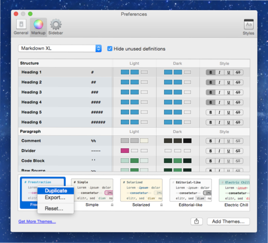
In Ulysses, you can create your own theme by modifying an existing one. Go to Ulysses’ preferences and select the Markup pane. In the lower part of the window you’ll see all available themes – Ulysses standard themes and those you downloaded from our Style Exchange. Choose the one you like most, right-click and duplicate it.
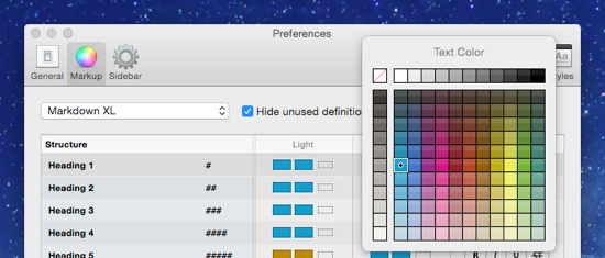
Right-click again and choose Edit. You can now name your theme and add an author. What you see below these input fields are the color palettes for both the light and the dark version of your theme. The first two swatches define the color of your editor background and the body text. The other color swatches are at your disposal for finetuning your markup.
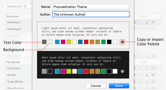
Clicking on a color swatch will open the color picker. You are absolutely free to choose whatever color you like. Changes of background and body text will instantly affect the preview of your theme. Additionally, select up to eleven accent colors you can later use for headings, emphasis, list, links and all the other available markup tags.
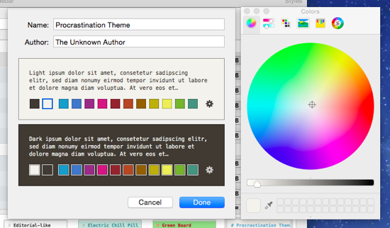
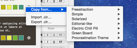
You can also copy entire palettes from other installed themes, or even import a home-made palette. For this, click on the little gear icon in your theme’s preview.
Side note: There are several dedicated plugins and tools you can rely on to build your own color scheme. As an example, try ColorSchemer Studio.
When you’re confident with the color palette, click Done. Now you’ll see a table allowing you to shape the appearance of your markup into great detail. For both the light and the dark version of your theme, you can now define the color of the tags, the tagged text and, where required, a line highlight. Just click on the respective swatch to open a color selection panel. Furthermore you can determine the text style in the right-most column: bold, italic, underlined or strikethrough.
You can make use of your palette’s colors in their pure version or in ligther and darker nuances. For example, you could display deep green text on a pastel green background for a link.
Combination possibilities are literary endless. You could even make markup characters virtually invisible by changing the tag color to the your theme’s background color (not that we recommend this).
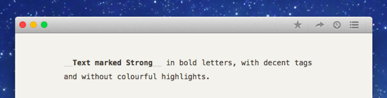
As an example, let’s assume you want to see text marked Strong in bold letters, with decent tags and without color accentuation. Go the row Strong and click on tag color. In the color selection panel, choose a lighter nuance of your body text color. Use no color at all for text and highlight, by choosing the crossed out white box in the upper left corner. Then, make sure to select Bold in the Style column.

Depending on the colors you chose for body text and background, text that was marked as strong will now in your editor look similar to this:
You’ll probably find that it takes a little to play around and select the right colors for a harmonious result. If you’re happy with the look of your theme, consider sharing it with the community, making others happy, too.
For this, select yours in the list of themes, click the Share button on the bottom and select Share on Style Exchange. This will lead you directly to an upload page, where you can add tags and a description. The preview images for your theme are generated automatically, but by double-clicking you can exchange them with a manually taken picture of your choice. Push Complete Upload, and you’re done.
What’s Your Setup?
This was the last step in our guide on customizing your writing environment in Ulysses. In case you missed a post, here is an overview:
Part 1
– Step 1: Editor-Only View
– Step 2: Enter Full Screen
– Step 3: Find Your Preferred Mode
– Step 4: Select A Font
Part 2
– Step 5: Adapt Editor Settings
– Step 6: Zoom to Make Your Font Bigger
– Step 7: Use Typewriter Scrolling and Line Highlight
– Step 8: Change Theme
Part 3
– Step 9: Download Themes From the Ulysses Style Exchange
Part 4
– Step 10 : Build Your Own Theme
Now that you are familiar with all the tools at your disposal, we leave you to fiddle with the appearance of your editor. If you want, mail or tweet us an image of your setup and include one or two sentences explaining why you like it this way. We consider publishing a selection of the most comfortable virtual writing studios in a future blog post.