This is the second part of our 10-step-guide to make Ulysses’ editor your writing home. In case you missed steps 1 to 4: this way please.
Step 5: Adapt Editor Settings
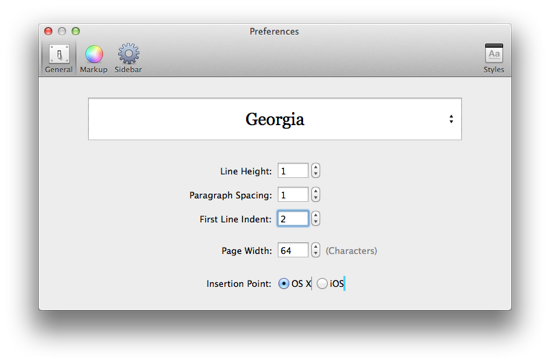
Preferences allow you to adjust the settings of the editor. Feel like a different line height and indented first line would make for a nicer look? Give it a try.
You can also set paragraph spacing. Default for this is Zero, since many of us tend to simply put a blank line to structure our writing. With Page Width, you can alter the number of characters before a line breaks. And finally, there are two different cursors to choose between.
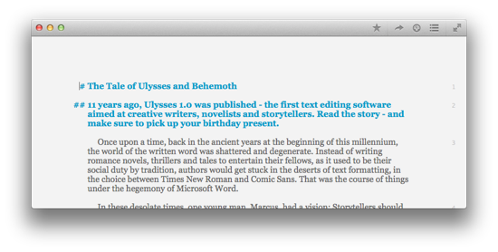
See how such tiny adjustments affect the appearance of the editor:
Step 6: Zoom to Make Your Font Bigger
Well, yes, it’s a very basic thing, but we’ll include it here for the sake of completeness. Of course you can make the font bigger, if your eyes get tired or you’re affected by farsightedness, or just because you like it that way. Or smaller, of course. Just use your habitual shortcuts ⌘+ and ⌘-. ⌘0 takes you back to default.
Step 7: Use Typewriter Scrolling and Line Highlight
Experienced writers regard these tiny features as very beneficial for their concentration. You’ll find them in the View menu.
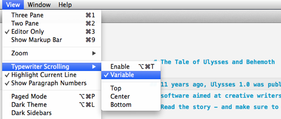
Line Highlight puts a light grey tint under the line you’re currently writing.
Typewriter Scrolling mimics the behaviour of a classic typewriter: The line you’re typing remains on the same spot of your screen. You can choose between fixed and variable Typewriter Scrolling. Fixed is the most classic: Navigating with mouse or arrow keys is like turning the knob on the side of a typewriter to move a piece of paper. It’s probably a matter of taste, but we found this a bit quirky. That’s why we added variable Typewriter Scrolling. It is activated by default and gives you the best of both worlds: Navigating works the way you’d expect, but once you start writing, the line remains fixed. You can choose for this line to be at the top, in the middle or at the bottom of your page.
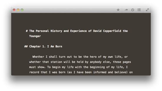
Step 8: Change Theme
Themes define the colours of your background, font and markup. They’re like virtual wallpapers for your virtual writing studio. Every theme has a light and a dark version, so you can easily switch between them (see Step 2). Ulysses ships with 3 harmonious themes for your viewing pleasure, each of them finetuned with lots of love by our designer.
If that’s not yet what you’re looking for, you can download more themes on our Style Exchange, and even tweak themes by yourself.